interactiveteaching tool · taken apart
Getting a room to describe how they write, in two minutes, without asking them to.
Everyone now has access to AI. What it cannot supply is the reader: their register, their call on what is good enough to send. This is a page that extracts that in seven screens, and this is how each screen earns its answer.
Open the thing itself
Both pages run in the browser. Read the story, or go straight to the builder and come out with a guide in your own words.
Ask someone to describe their own writing voice and you get nothing usable. They will say “clear and professional”, which describes everybody. So the page never asks. It offers pairs of real sentences and lets them point, sets every default to an opinion they can disagree with, and leaves the one genuinely hard task until they are six screens invested. The output is a guide in their own words that they never had to write.
The challenge
AI writes competently and generically. The gap between competent and send-ready is the sender: how they open, how direct they are, what they would never say.
That information exists only in the person's head, and the standard way of getting it out, a form asking them to describe their tone, returns adjectives that fit everyone.
A training deck explaining this changes nothing. People agree with slides and carry on pasting the same prompts.
How it was approached
Build the thing rather than describe it, and make finishing it easier than abandoning it.
Every screen asks for one decision, in rising order of effort, and each one shows its consequence immediately rather than banking it for the end.
The reader leaves with an artefact they can paste in front of any model, which is the part that survives the session.
the buildseven screens, in the order they ask
Each screen asks for slightly more than the one before it.
The order is the design. Reversed, almost nobody would reach the end.
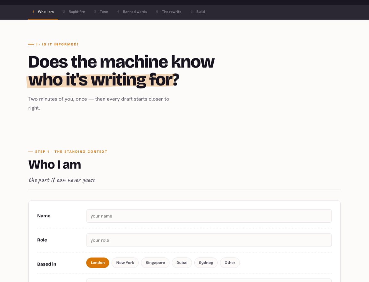
screen 01
Open with a question
The first screen asks “Does the machine know who it’s writing for?” and then stops. A reader answers a question in their head whether they mean to or not, which is the cheapest engagement available and the only one that costs them nothing.
A title announces. A question recruits.
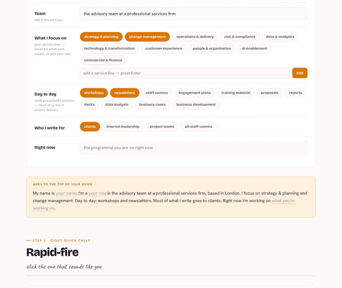
screen 02
Ask for what needs no thought first
Name, role, city. Then chips for service lines and deliverables, several already selected. Nothing here requires the reader to introspect, and because the chips arrive pre-picked the page is never a blank form: they are editing rather than authoring.
Every default is an opinion. A page that starts empty asks the reader to be the author.
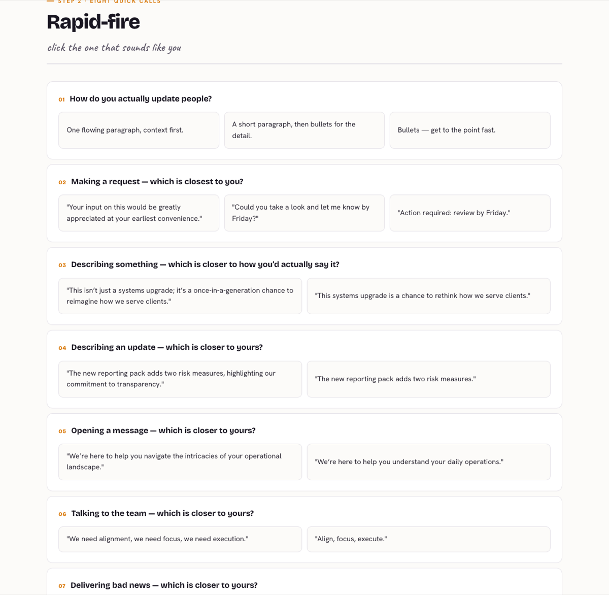
screen 03
Recognition over recall
Eight pairs of real sentences, click the one that sounds like you. Nobody can describe their own register on request. Everybody can pick it out of a line-up. The accent colour lands on the choice, so the reader can see how far through they are without a progress bar telling them.
If a question needs self-knowledge to answer, replace it with a choice.
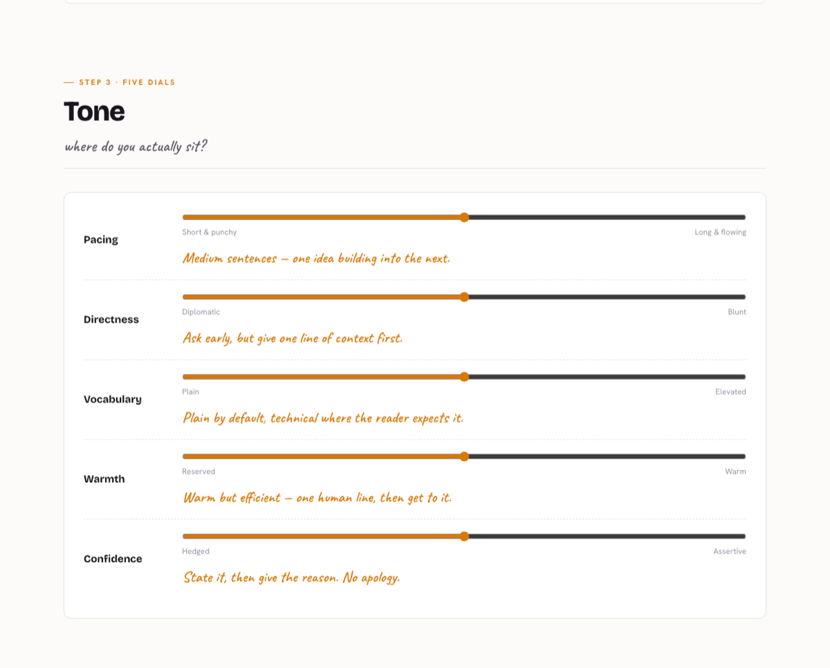
screen 04
Put the consequence next to the control
Five dials. Move one and the page writes the resulting instruction underneath it, and names the failure at that end of the range. The reader is not guessing what “blunt” will do to their writing: it is spelled out under their thumb as they move it.
A slider with no consequence attached is a toy. Show the sentence it produces.
screen 05
Make the tedious answer the default
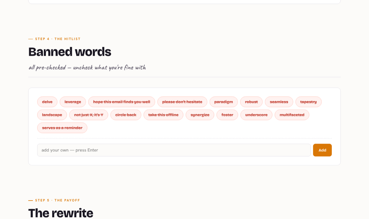
Seventeen banned words, every one pre-checked. Unchecking three is a moment’s work; ticking fourteen is a chore nobody finishes. The page takes the opinionated position and lets the reader dissent from it.
Ask people to disagree with a strong default, not to build a list from nothing.
screen 06
Save the one hard ask for last
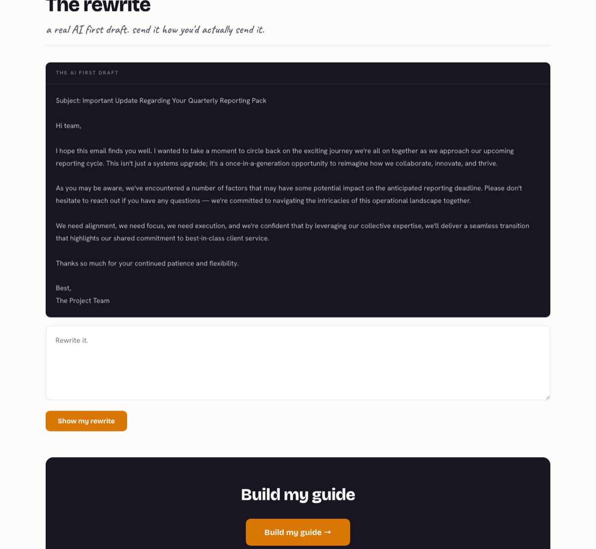
A genuinely bad AI draft, and an empty box. This is the only screen that asks for real writing, and it arrives after five screens that cost almost nothing. By this point the reader has invested enough to finish.
Sequence the asks by cost. The expensive one goes last, or it goes unanswered.
screen 07
Stage the payoff
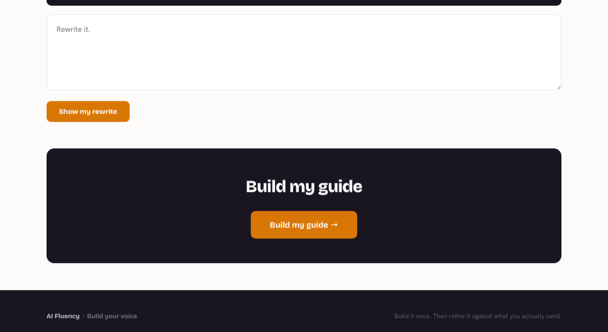
One button, then a loader that says what it is doing: reading your choices, matching your tone, writing your guide. The wait is three seconds of theatre over work that is instant, and it is what makes the output feel made rather than retrieved.
A result that appears instantly reads as a lookup. A result that assembles reads as a product.
the craftwhat is doing the work
Three things carry an interactive page, and none of them is the interactivity.
01
Colour with one job
A single accent, used only where the reader has made a choice. Nothing else on the page competes for it, so the accent doubles as a progress indicator without a progress bar existing.
02
Animation that paces rather than decorates
Sections fade up as they arrive, which sets a reading speed and stops the scroll feeling like a wall. It also honours reduced-motion, where the whole thing renders flat and loses nothing.
03
A story before the first question
The companion page opens on forty thousand years of people explaining things to each other, from a cave wall to a clay tablet. By the time anyone is asked to fill in a field, they are inside an argument rather than a form.
open itthe tool itself
Reading about it is the weakest version of this.
Both pages run in the browser with nothing behind them. Start at the story, or go straight to the builder and come out with a guide.
the lawwhat this one proves
If the reader has to do the work, make the first step free.
Any page that needs something from its reader is negotiating. Open with the cheapest possible ask, show what it bought, and only then ask for something that costs. Most tools do this in reverse and wonder why the completion rate is what it is.
Converted from Hong Kong dollars at indicative rates. Work is quoted and billed in HKD.
Something your audience uses.
Turnaround is agreed with you before work starts.
Or write to hello@enzwa.com
Put the guide to work.
Voice Review applies selected word rules to a draft, shows proposed edits and checks phrases before export.